Graphic Design USA’s 60th Anniversary Logo Design Award Winner
The American Graphic Design Awards competition announced this week that our logo design for San Miguel Joint Union School District (SMJUSD) had won! The award letter states, “From 8,000+ entries, less than 10 percent are recognized today as winners.” This means that the San Miguel Joint Union School District logo won in the top 10 percent of the nation! Out of all our work in 2022/23, we only submitted the SMJUSD logo project to this contest. As a result, this project is now a logo design award winner! This year’s contest marks the 60th Anniversary of the best-of-the-year flagship awards program from Graphic Design USA (GDUSA).

The Client: San Miguel Joint Union School District (SMJUSD)
Logo design is my favorite type of work within my design abilities. I was super excited to be chosen to work with the small team at SMJUSD. We were tasked with re-branding the district to enhance growth in the student body and recruit personnel. I spent four weeks in the design process before landing on this final, award-winning logo that satisfied all of us.
SMJUSD is a small, two-school district on the north edge of San Luis Obispo County. Consequently, Mission San Miguel physically separates this school district from all the other school districts in the county. Mission San Miguel isn’t just an essential part of our rich California history but also a visually iconic mission seen right off Highway 101 as you drive by. The district offices are located in the small town of San Miguel within the Lillian Larsen Elementary School.

The Logo Design Process
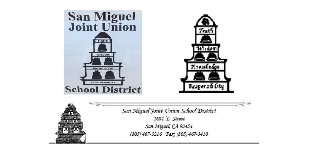
Starting the logo design process is similar to sitting at a jigsaw puzzle and looking for pieces that fit together. My goal is always the same: to solve a puzzle with many seemingly random pieces in a way that artistically conveys embedded meaning. Similarly, my puzzle pieces are the client’s history, goals, corporate or personal desires, collective ideas, and surroundings that have impacted them. A good logo summarises all those pieces with visual integrity. My process on this logo design started by being given the three old logos shown below. As you can quickly see, they badly needed re-branding. Fast forward to the new logo design above in color and black and white; I love the simplicity and clarity of the final design solution.


Simply stated, this new logo glances at the iconic school bell and the robust arches and bells of Mission San Miguel. Finally, these pieces bring together SMJUSD’s mission of quality education and their proximity to the Mission.

Check out the other awards we have won this year: GDUSA HEALTH & WELLNESS AWARDS
See more Studio 101 West LOGO DESIGN
